Take a Once Over

At this very moment I find myself engaged in negotiations regarding the contract for my next book, All Star, with NBM, the publisher who published my first two graphic novels. Talk of money and rights are of very little allure to me despite the consequence both money and rights naturally have. Cover illustrations, on the other hand, are much more exciting. Is it procrastination to delay responding to an email regarding the details of a contract to work on a cover for the book with which the contract is concerned? Perhaps.

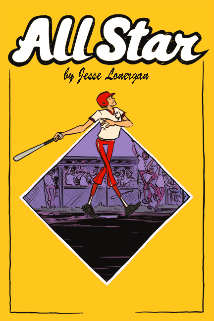
In any of event, here is a draft version of the cover of the book. If anybody were to offer any comments, criticism, or suggestions, it would make me most happy.

Comments

E. J. Barnes said…
Presumably the space in the bottom border is for the "NBM". The scene itself, with the diamond, is good. I can't put my finger on how, though, but the lettering for "All Star" doesn't look baseball-y enough. I think you're trying to make it look like the lettering you would find in a sports team logo; in this case (since the culture of baseball is so steeped in nostalgia) the more it resembles something out of the earlier half of the 20th century, the better.
Roho said…
Love the colors and the composition, I think the "all star" works pretty well, it's clear bold and poppy enough, find a better font for your name. Also you could have little stamps or stickers randomly on the yellow part with more info, like accomplishments or records by the main guy.
Anonymous said…
I think this would look better without the black borders. I also find myself wanting to see more of what's in the diamond, but I can see why for composition it wouldn't be bigger. Anyway, minor nitpicky things. I don't see why you couldn't ship with this!
J. L. Bell said…
Your art can convey a terrific sense of movement, but this sketch seems to be tamping down that quality. The batter is at the end of his swing and is acting as if he's done nothing unusual, which may be right for the character but less good for attracting readers' eyes. At first glance he might even look as if he's walking to the plate rather than batting. The major movement in the sketch comes from the players in the dugout, and the frame cuts them off. The composition and typography seem fine to me. The copy on the back should make clear this isn't a Matt Christopher story for young readers.
ETCIllustration said…
Great start on the cover, Jesse!

I agree that your name should be in a different font, although I like the look of "All Star."

The points where the diamond meets the character are creating some distracting tangents; I think it would suit the composition better if the diamond shifted up, showing more sky/dugout and less ground. Or maybe if the baseball-diamond-reference included the outfield, with a semicircle at the top? (http://www.profilebrand.com/imgs/layouts/40sports-baseball-mlb/928/928_L-animated-baseball-field.jpg)

On the subject of tangents, watch out for where the fingers of his left hand meet his torso!

Love the scene happening within the diamond, and the character looks great!
Jesse Lonergan said…
Awesome, awesome, awesome, awesome, awesome. Thanks, guys.
Joel C. GIll said…
I agree with Ellen. There is something going on with where the diamond reaches the figure. The color is fantastic. I would mess with the keening a little. That might help with the title. Again the color is great. Is the book done?
Jesse Lonergan said…
The book is about halfway, but NBM wants a cover soon.
Unknown said…
This is a little random, and since others didn't comment it may not strike anyone else that way, but the purple triangle of background above where his legs cross really jumped out--maybe b/c it looks kind of like a stylized female pubic triangle at a glance. I think if the background were a slightly toned down purple it would recede more and wouldn't have that effect. Otherwise, I like it!
Jesse Lonergan said…
Not random at all! A number of people have pointed that out.